 Georges Seurat accomplished all the sophistication of his masterworks with just dots of light (do I hear pixels?) and perfect mathematical shapes (do I hear vector shapes?). Can we look back to breakthroughs a century old to better understand today? Meet the man who was way ahead of his time in this addition to 2-minute design histories. Design inspiration, in as quick as you can cook a pack of instant noodles.
Today, we have no choice but to work in dots – but imagine, the pointillists did it on purpose, believing it was a superior way to make color. I think we need a flashback sequence...
Paris, 1890. Science was in. The new surge in industrial technology and “rational” knowledge was opposed by Romanticism but embraced by the “Neo-impressionists.” These cutting edge artists were determined to make of art a precise and orderly thing, with the help of science. At this same time elsewhere Victoria reigned in England and a drink called Coca Cola was introduced to a young United States. But that’s irrelevant. Back to art and design.
The first pointellist work, Seurat’s “Bathing at Asniere” was met with that combination of outrage, disgust, excitement and apathy that one expects for anything really good. The Post-impressionists were even rejected by the I Impressionists. Renior, Monet, and Degas all passed by the same cafes as Seurat, Gaugin, and Van Gogh, but they probably threw napkins at each other. And few of them actually sold their work to the public whose tastes were, as you can imagine, even less tolerant ( “Boys with their clothes off, what ze hell is this?”). With little support from the world, the Post-impressionists formed a salon of their own.
So why the dots?
“Since I first held a brush I had been looking for a form of Optical Painting” quoth George. Discoveries in Chemistry by scientists like Chevreul gave him his wish. Seurat divided up color on the canvas so that it could be blended by the eye, instead of on the pallete. Wait, my eye is paint blending? Sure thing, just like it does on screen.Looking at a screen, you never really see purple. Your choices are RGB. You’re looking at some blue and some red so tiny and close together that they merge visually to look like purple. That’s precisely what Seurat wanted to do on his canvas. Patient man.But why make life so difficult for yourself? The idea was that in this way, you create light rather than pigment, which creates a more realistic sensory experience and more saturated intense colors. Georges was right. We know that screen colors always look more intense than print outs. Seurat was trying to achieve that kind of intensity, but with paint and canvas and in 1884.
The verticals of Trees
As if the use of light for color wasn’t enough to make George a total anachronism, he also preferred vector art. (No, really.) First of all, lines have feelings too. According to Charles Henry, a psychologist and all around influential guy in fin de sicle Paris, certain combinations of verticals and horizontals yield different responses from the Psyche.Seurat’s attention to line structure was so complete that some have called him a “picture architect”. “He cut out a terrace of horizontals in the space before him and made as much as he could of the right angles and diagonals that architecture offered.” says John Russel in his book Seurat.
George used the same shape for his nurse in La Grande Jatte as he did for a haystack in an earlier sketch (copy paste haystack to nurse). What you can see is that he consistently achieves an essentialism of form that can be a great inspiration to modern day designers.“I want to make modern people move about as if they were on the Parthenon frieze, in their most essential characteristics.” Essentializing form is something we do constantly to create logos, icons, and interface architecture.
Let’s face it, this guy was not only born in the wrong century (and couldn’t get a job because of it), he’s beginning to make us look bad. Whether it’s his dedication to color as light, his architectural approach to verticals and horizontals, or his essentialism of form – there’s something in Georges Seurat to inspire any designer today. So check out the online field trip.
Online Field Trip: Discovering Georges Seurat

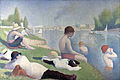

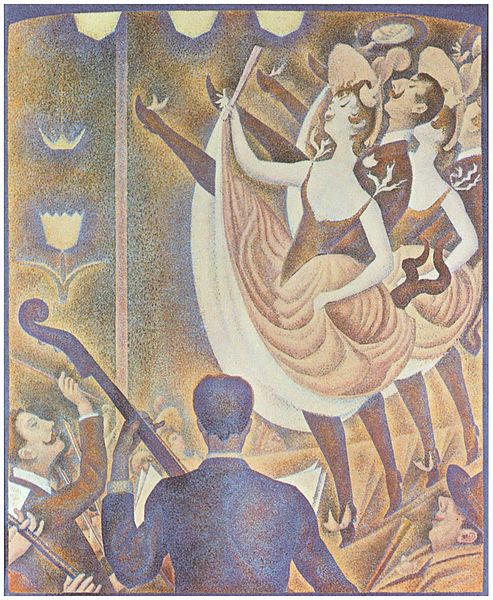

- Seurat at a Glance - A Wikipedia Commons search on Seurat produces a suprising number of his studies, early works and his most important paintings, like, La Grande Jatte - Bathing at Asniere (detail) - The Cricus (detail) - The Eiffel Tour - The Parade
- Essentialism of Form: These studies and paintings show Seurat's ability to essentialize form without sacrificing the beauty or humanity in his subjects. Woman seated -Man seated - Farmer - Boats - Town on Port-en-Bessin
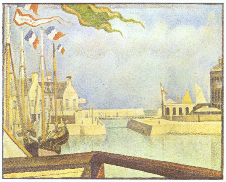
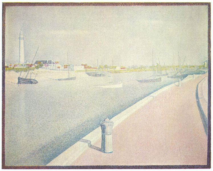
- Lines & architecture - Petite Fort-Phillippe -Port-en-Bessin(1) - Port-en-Bessin (2) - Flags - an evening on the canal - Ships in Honfleur
- For fun - The models - take a peak inside his studio with La Grande Jatte hanging on the back wall. His girlfriend - well maybe, getting dolled up for a night out?
- The Art Institute of Chicago – Holds his signature Masterpiece "A Sunday Afternoon on the Island of La Grande Jatte" in addition to associated sketches.
- Sunday in the Park with George – But wait, there really is a musical. Don't cringe, this is the real thing: more high art theater piece than radio remix. The music itself almost paints in dots but with an orchestra. And it's no pseudo-intellectual oddity either, it's an inspired and moving play that takes a philosophical and very human look at the art industry, artistic innovation, human relationships and community. The score is by Stephen Sondheim (of Sweeney Todd fame - but Tim Burton's not involved, so there's no blood and George doesn't get his head hacked off.)